Science Building Wayfinding
The science buildings at Millersville University have, for some time, been under scrutiny for its complex layout and poor navigational ability. Students find themselves struggling to get to class or even know what building they are in. The task I was faced with was finding a solution to this wayfinding issue that will facilitate student and faculty interaction with the science buildings. The best way to conquer this is through updated signage and new wayfinding techniques.
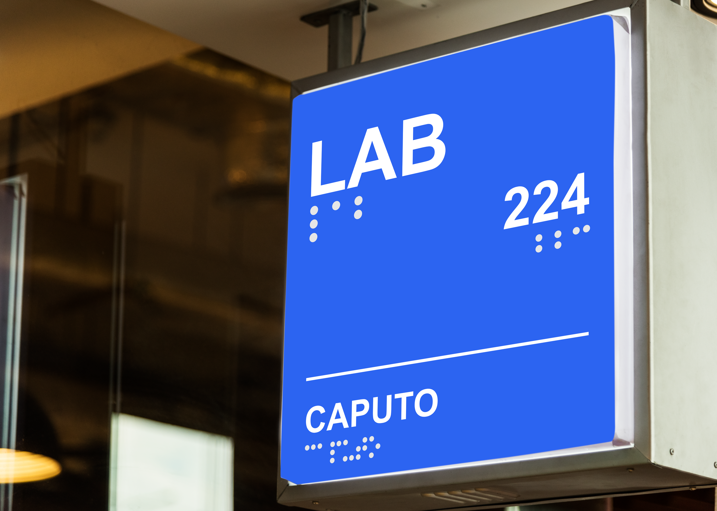
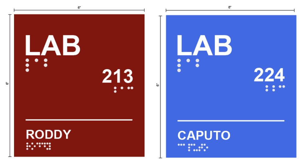
Sign Mockups
Final Presentation
Research/ Observations
The key to finding the best solution for the navigational struggles of the science buildings was to carefully analyze the current state of the area. There were three key questions I wanted to focus on in my observations:
How do new or returning students and faculty interact with the buildings features?
What is the current signage and how effective is it?
Is the building and its wayfinding features disability friendly?
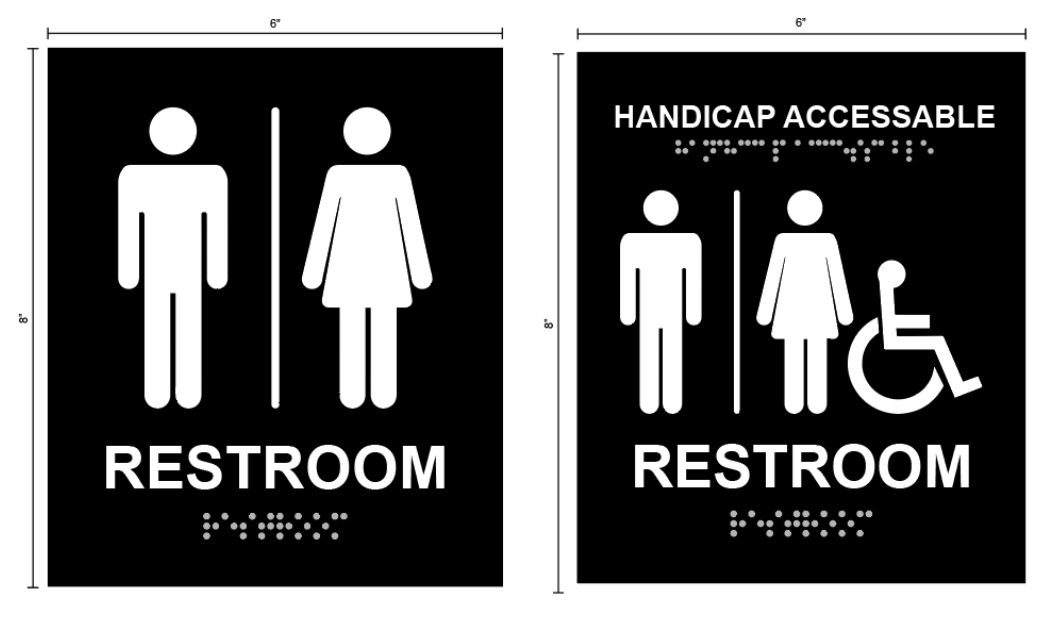
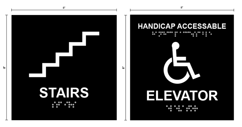
All these questions went hand in hand with my research, but all had special qualities in each that would lead me to the best solution. I wanted to hone in on the accessibility quality of the building because I feel it’s important we meet needs for everyone when it comes to navigating a building. This meant meeting needs for people in wheelchairs, that are deaf, etc. A focus on this required further research to make sure I met certain specifications for each disability (signage 50” off the ground, brail on signage, etc.).
Main Issues
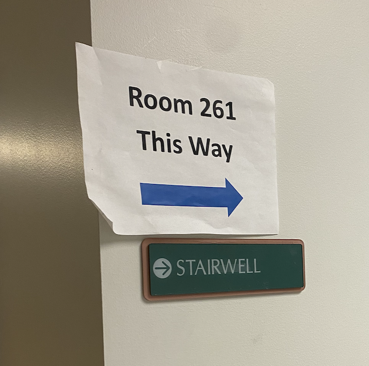
The signage was 50% pieces of copy paper with shoddy, sometimes misleading, directions on them.
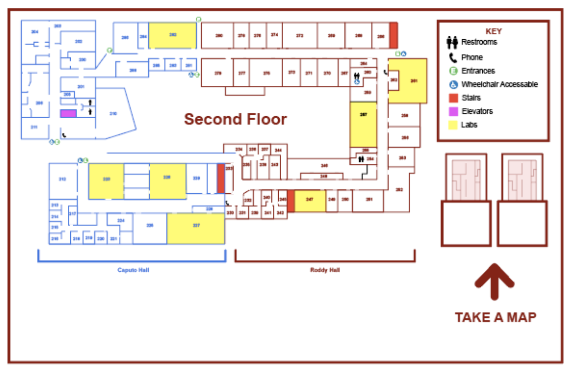
Students don’t know which science building they are in, Roddy or Caputo (the two sciences buildings that make up the complex).
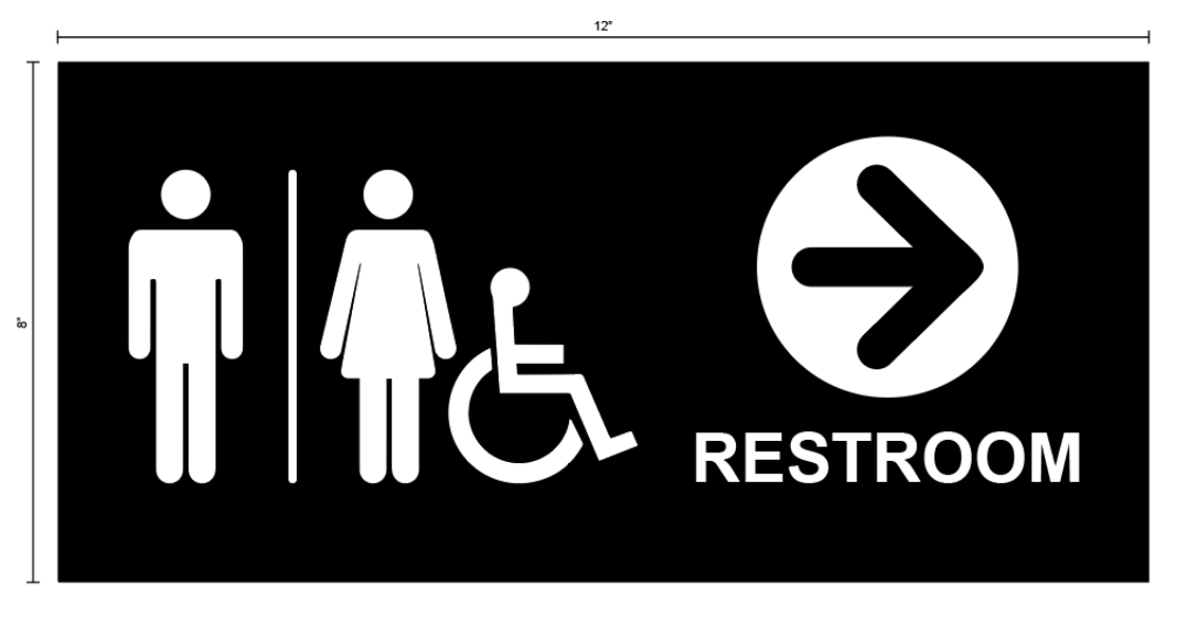
The bathrooms aren’t well marked and are tucked away in the corners of the buildings without proper signage to find them.
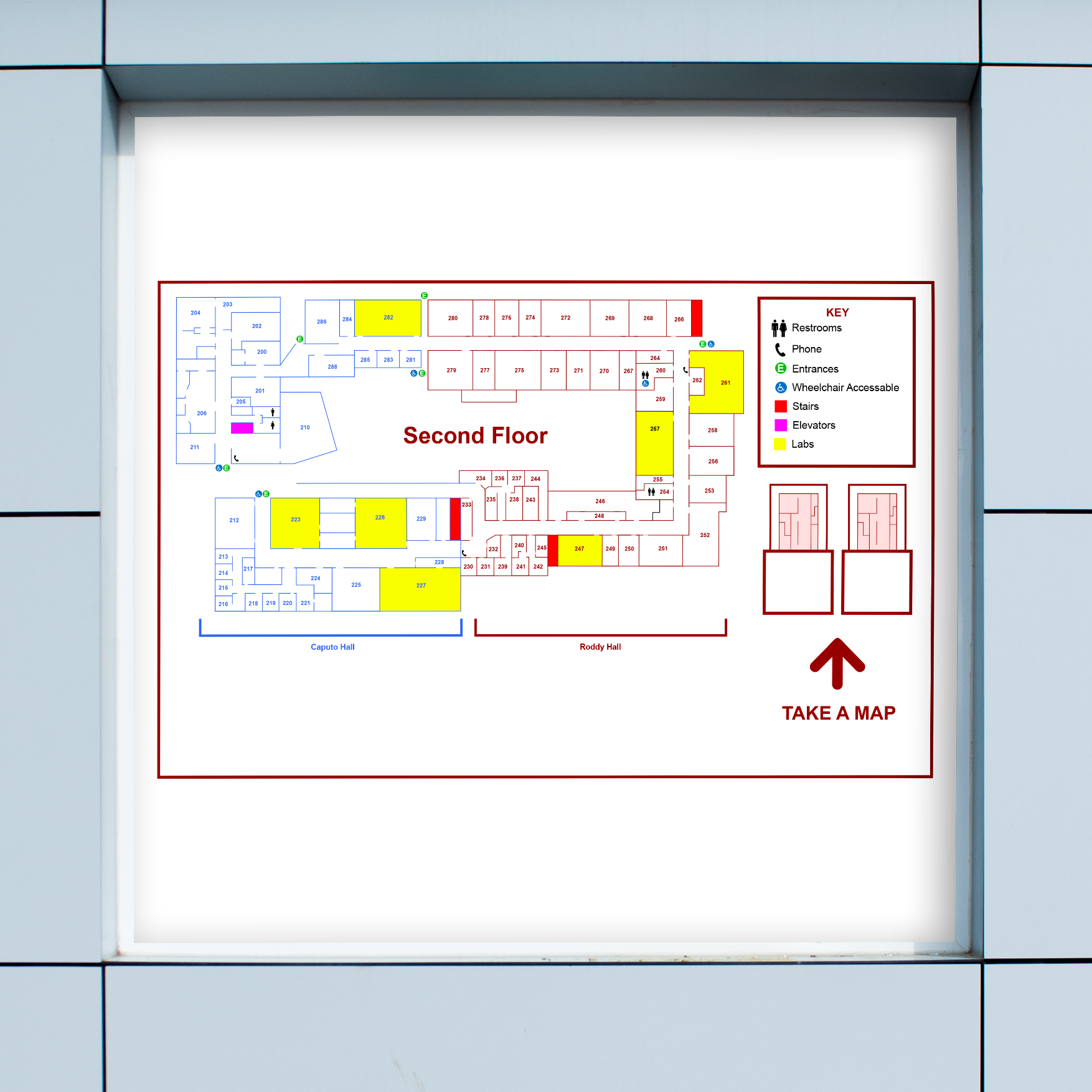
There aren’t any well defined, easy to read orientation maps of the buildings to help students find their way around.
Redesign
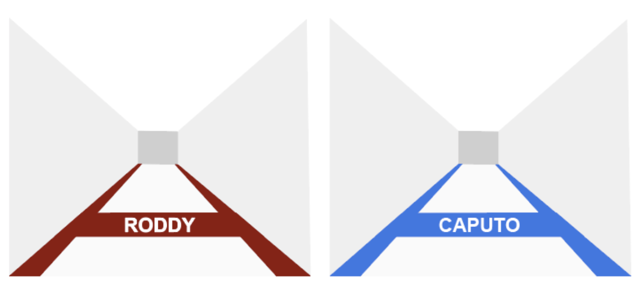
With all the research I gathered, I sought to make new signage that would clearly state which building you’re in, have a consistent layout, and accessible to people with disabilities. I decided it was best to pick two colors that could easily be deciphered from one another, especially for people who are colorblind, for each building.
Final Wayfinding Design


